No Lonr
.com
The marketing site that turns scrollers into riders — designed and built to launch No Lonr, capture early-access signups, and set the brand tone before the app even ships.
§ 01 — Vision
The
Vision
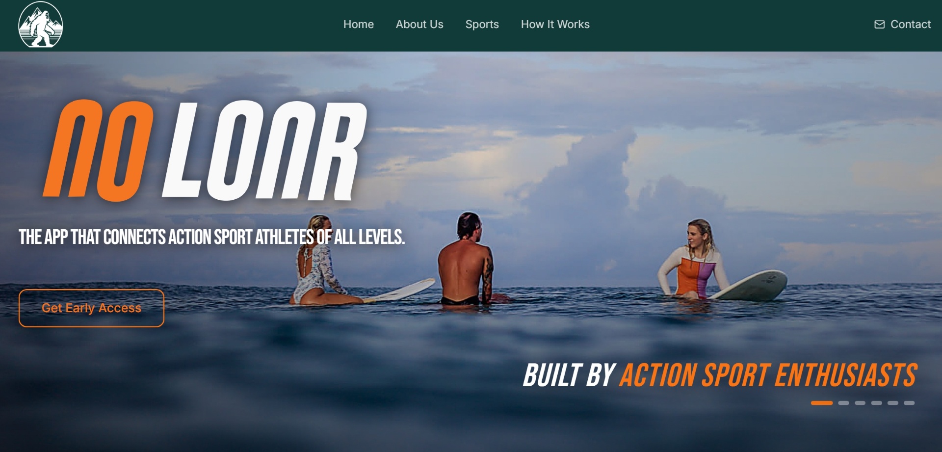
No Lonr is an action-sports social app — but before riders can download it, they need to feel it. The site had to do the heavy lifting: explain the product in under five seconds, look like something the core community would actually share, and pull people into the early-access list.
The brief was simple — make a site that looks like a brand, not a startup. Deep forest greens pulled from the logo, high-energy orange accents for the action, italic stencil typography that carries the speed of a sticker slap on a skateboard. Every section earns its scroll.
§ 02 — Frame the Problem
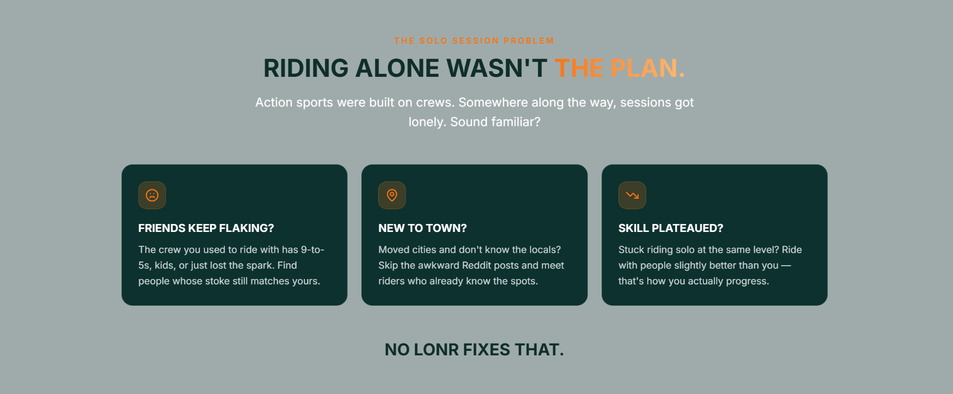
Name the pain.
Before pitching the product, the site names the feeling every rider knows — friends flaking, new city, skill plateau. If you nod, you scroll.
§ 03 — Show the World
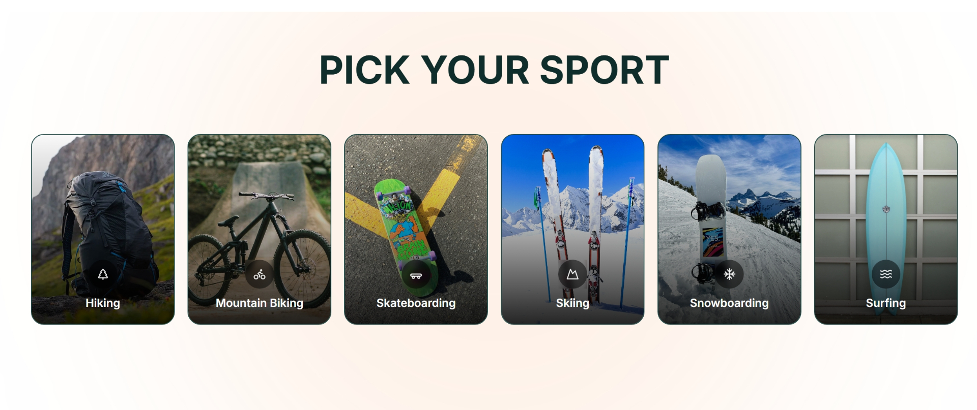
Pick your
sport.
Action sports are visual — so this section is too. Hand-picked imagery for hiking, biking, skating, skiing, snowboarding, and surfing tells riders: this app is built for you specifically, not a generic “sports” bucket.
§ 04 — How It Works
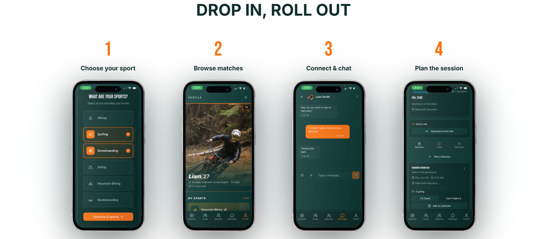
Drop in, roll out.
Four phone mockups, four steps, zero confusion. The app sells itself in a single horizontal glance.
§ 05 — Why No Lonr
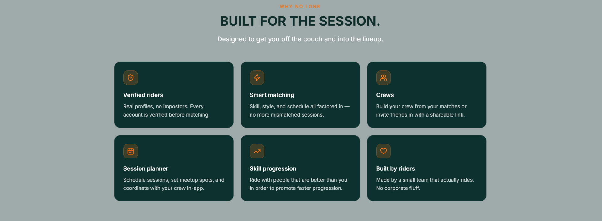
Built for the session.
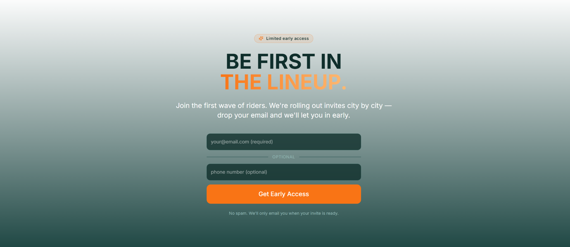
§ 06 — Convert
Be first in the lineup.
The whole site is a funnel toward one orange button. Limited early access, city-by-city rollout, no spam — copy designed to feel exclusive without being precious.